Sharp Academic Coaching logo & card
Logo & Back
|
Front
|
overview
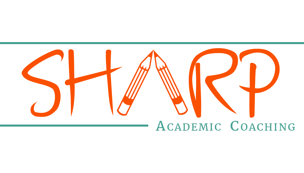
My good sister-in-law, Kristy, started up her own business with a great lady named Michelle Selui. It's an academic coaching business called Sharp Academic Coaching. Their purpose is to help kids that are struggling in school and also kids that are preparing for college. They do an amazing job with the kids, teaching them life-long skills that will help them forever. I wish I would've had them to help me through school! (In fact, I could probably use them now.)
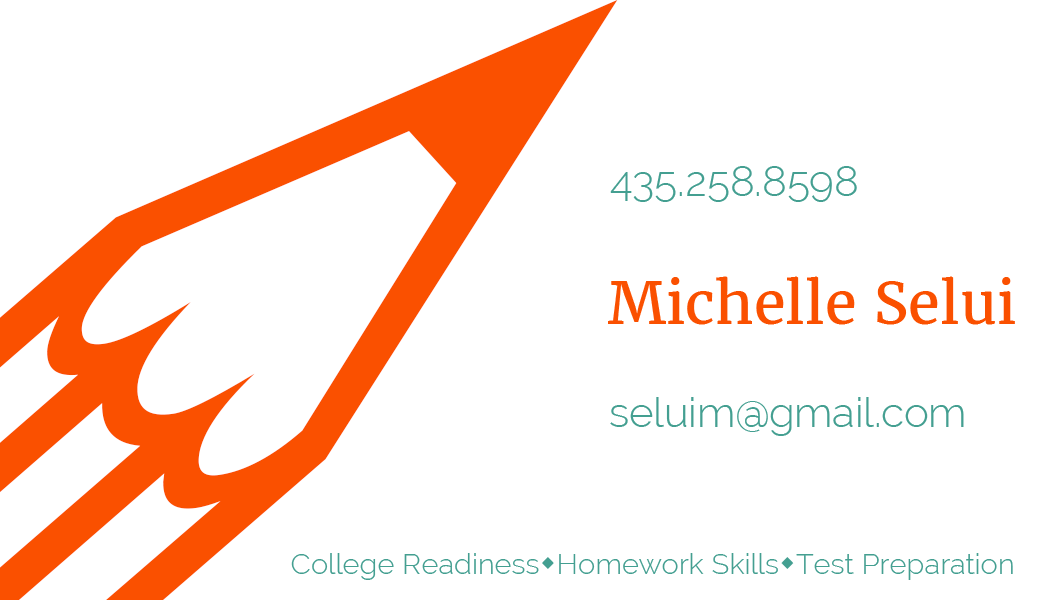
I was super honored to design their logo, business cards and flyers. (You'll see the flyer in the next exhibit.) When designing the logo, I wanted it to look "sharp," and also to have a school theme tied in so that when people see it they know right away what the business is. That's why I made the "A" into pencils. The top and bottom lines make it tight and professional looking. The font chosen was sharp, and had a handwritten, school feel to it. The colors chosen are complementary, maintaining a nice balance.
photoshop skillsShape & Text Tools
Artboards (Multiple) to Find Right Combinations |
design elementsContrast- Color is the main way that contrast is used, but also the size of the pencil (Back)
Repetition- Repeated lines on top and bottom, and also fonts Alignment- Logo: aligned right down the middle. Card: aligned the text with the tip of the pencil (Back) Proximity- Made sure the text had space, but was still in close proximity Typography- Used both serif & san-serif fonts, complementing each other well |
Fonts: Merriweather Bold, Raleway, & AFE_Jen_Bold
